Introducing the new logo of Claire Vo Studio
Hello all,
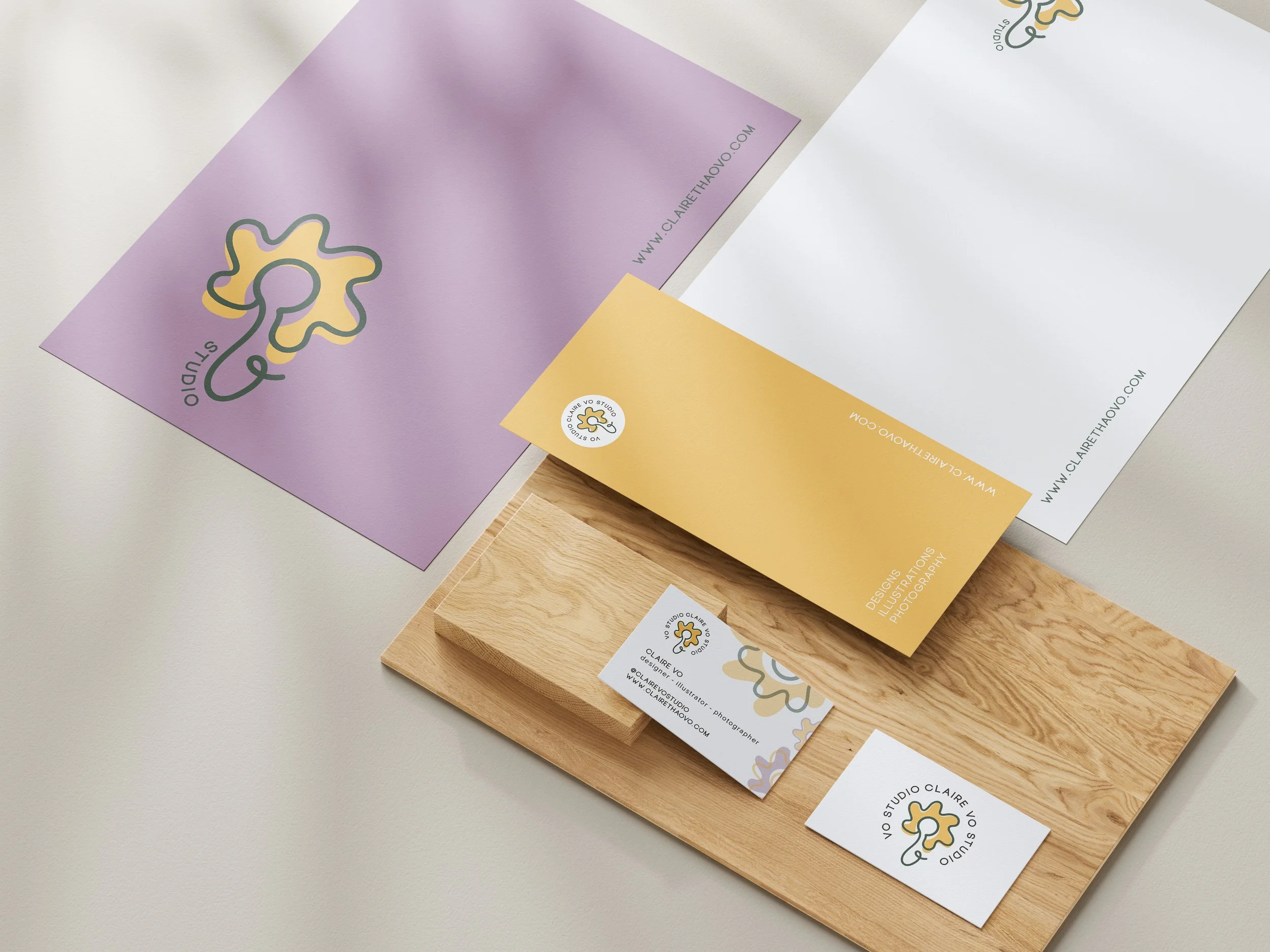
I’ve been thinking a lot of my own personal branding and I have to say it’s not an easy task! but I am very excited to share what I’ve been working on and to present my new logo for my own design studio, Claire Vo Studio.
My career definitely has lots of ups and downs with a lot of twists and turns and many tempting parking spaces. But what has always been consistent for me is my passion for design and how natural it is for me to gravitate towards good designs. I found that I really enjoy branding and designing logos. I’ve learned a lot throughout my career and am thankful for all the opportunities that I had. It definitely made me a better designer and trained my eyes to pay attention to details a lot more.
The logo is created with the letters C and V in mind. I started out playing with the shapes and started to explore what I could make out of these two letters. My first idea was an ice cream cone! but I thought it was more on brand and true to myself if it was a flower. :)
You can see below, the letter C is positioned in the middle and acts as the pistil of the flower. To create a stem, I drew a connecting organic line down and curved it up towards a cursive V.
As I kept looking and critiquing my own work, I started to think it was looking more like a chicken LOL, but maybe that’s just me never being satisfied with my work and always trying to find things to improve or fixate on. With all that being said, I do feel happy with how the logo turns out! but feel free to leave a comment below and let me know what you think or if there’s any input to make the design even better!